

Santander UK | Interior graphics
As part of the rollout of Santander UK’s multi-use headquarters, Unity Place, a consistent yet versatile visual language was required, that could be applied consistently across a variety of environments.
Deliverables: A graphic system adaptable to multiple surfaces and scales, emphasising the Santander brand while maintaining visual consistency across various interiors.

The design development explored several creative routes, each grounded in research into Santander’s corporate heritage, the identity of Milton Keynes, and the potential to connect the two through graphic storytelling. By cross-referencing various features from the history and geography of both cities, a graphic language began to develop.
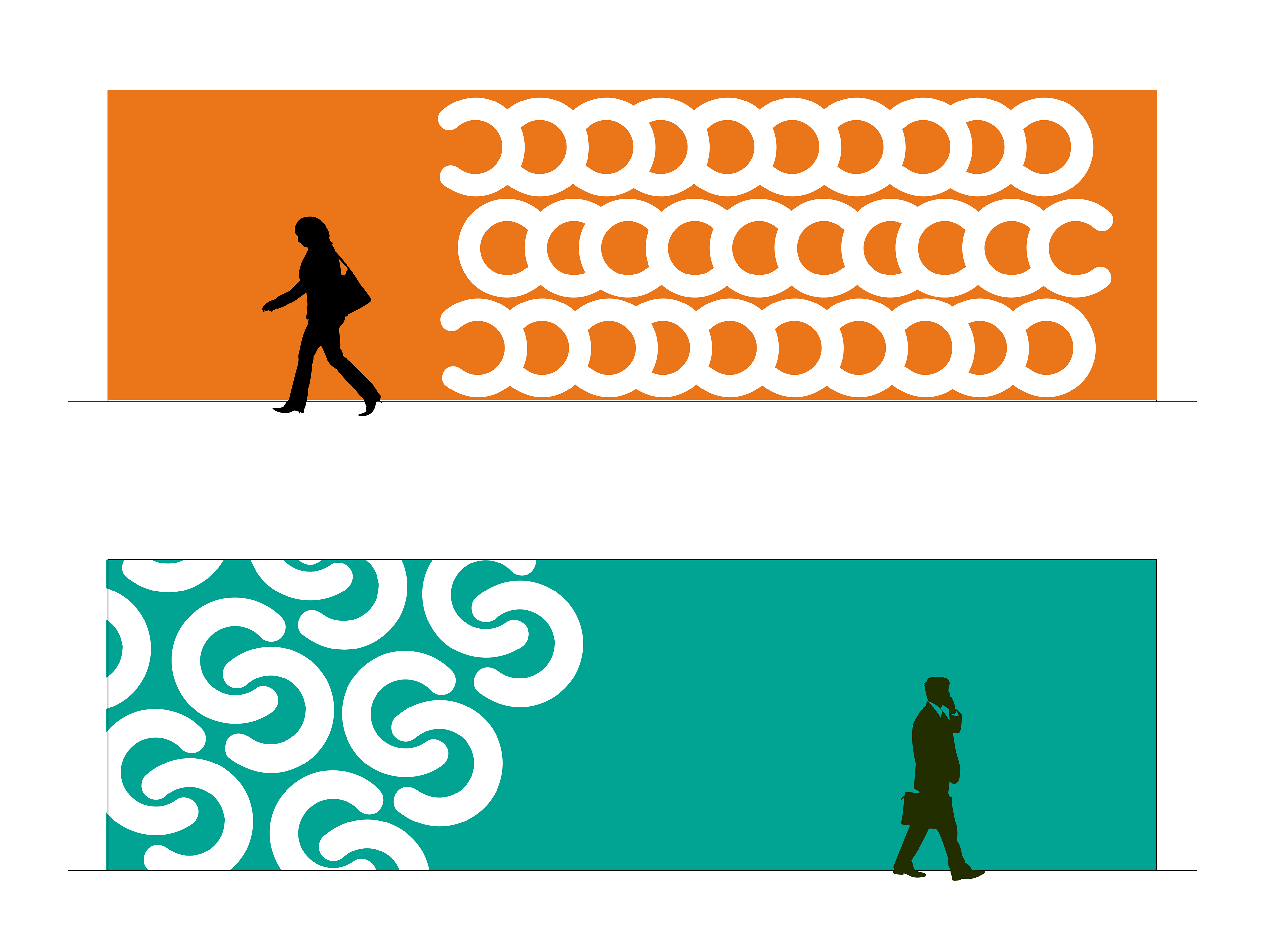
Explorations into potential applications included large repeat designs across brightly coloured interiors. As discussions continued, it became apparent that a more flexible design that would provide contrast on the already existing black walls would be preferable.

Following consultation with key stakeholders, a series of white vinyl graphic applications referencing Santander's Spanish history was selected. The circular repeat patterns were inspired by architectural features from the city of Santander, as well as traditional Spanish tile designs.

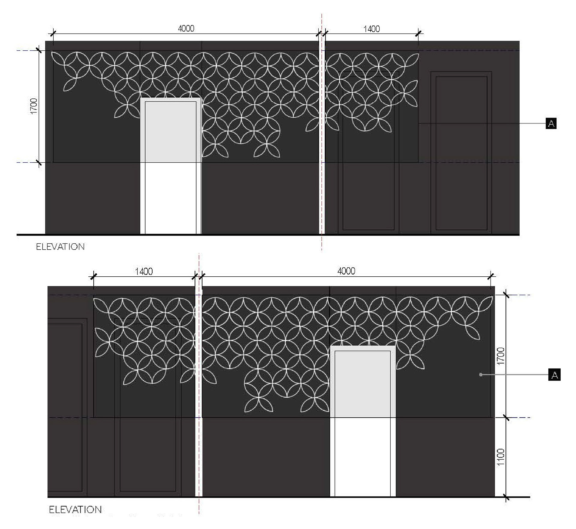
Outcome: A carefully considered series of graphics with built-in adaptability, that contrasted well with the existing interiors. The clean, geometric designs were straightforward to produce in vinyl and quick to install, ensuring the next phase of the project rollout progressed on schedule.
