

LOM architecture & design brand refresh
LOM architecture & design, a medium-sized architecture and interior design studio located in Shoreditch, London, sought to modernise and refine their brand identity. The aim was to update the brand's visual identity without undergoing a complete rebranding process.
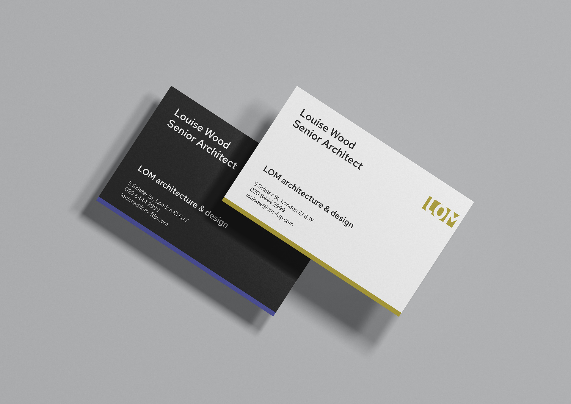
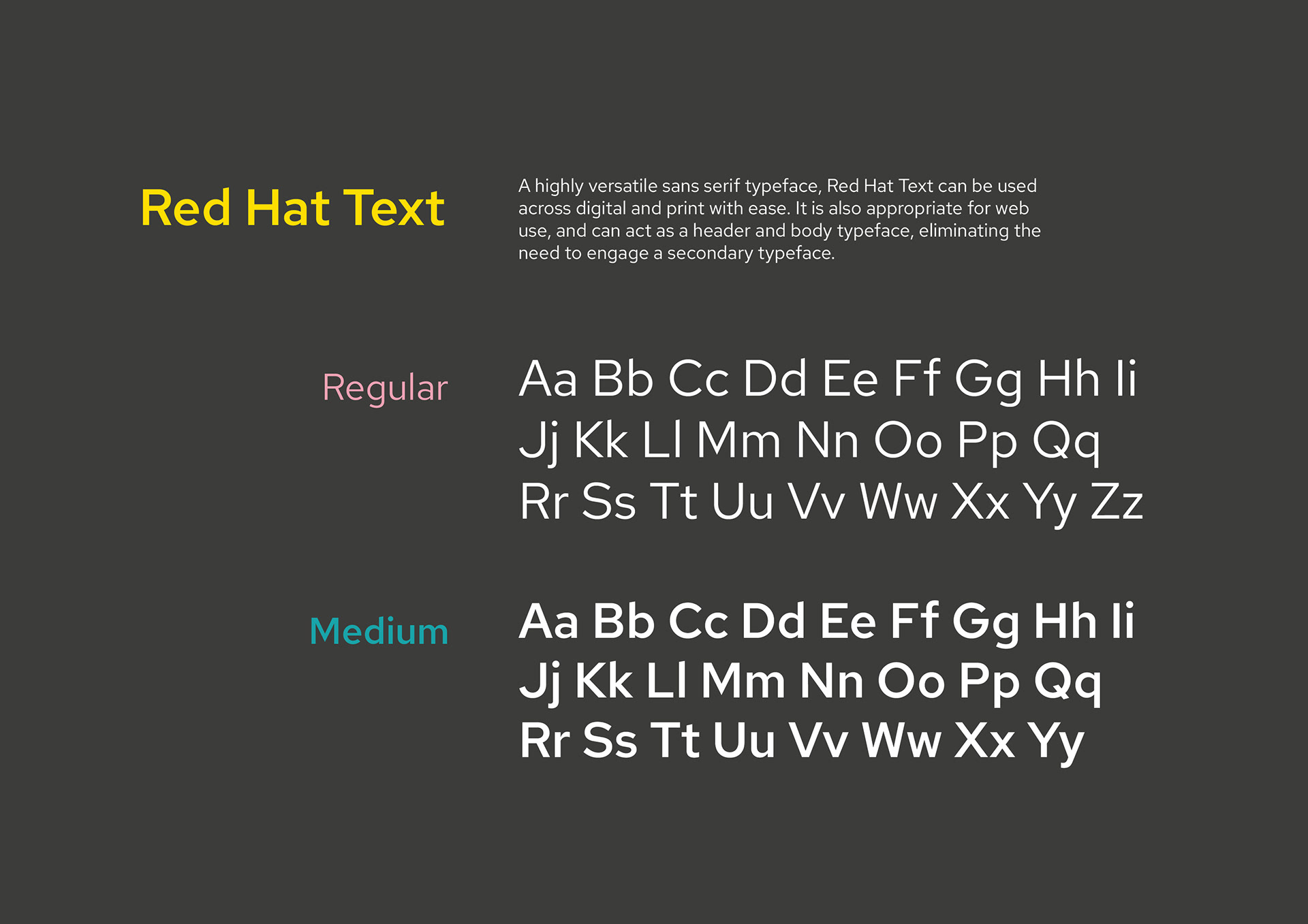
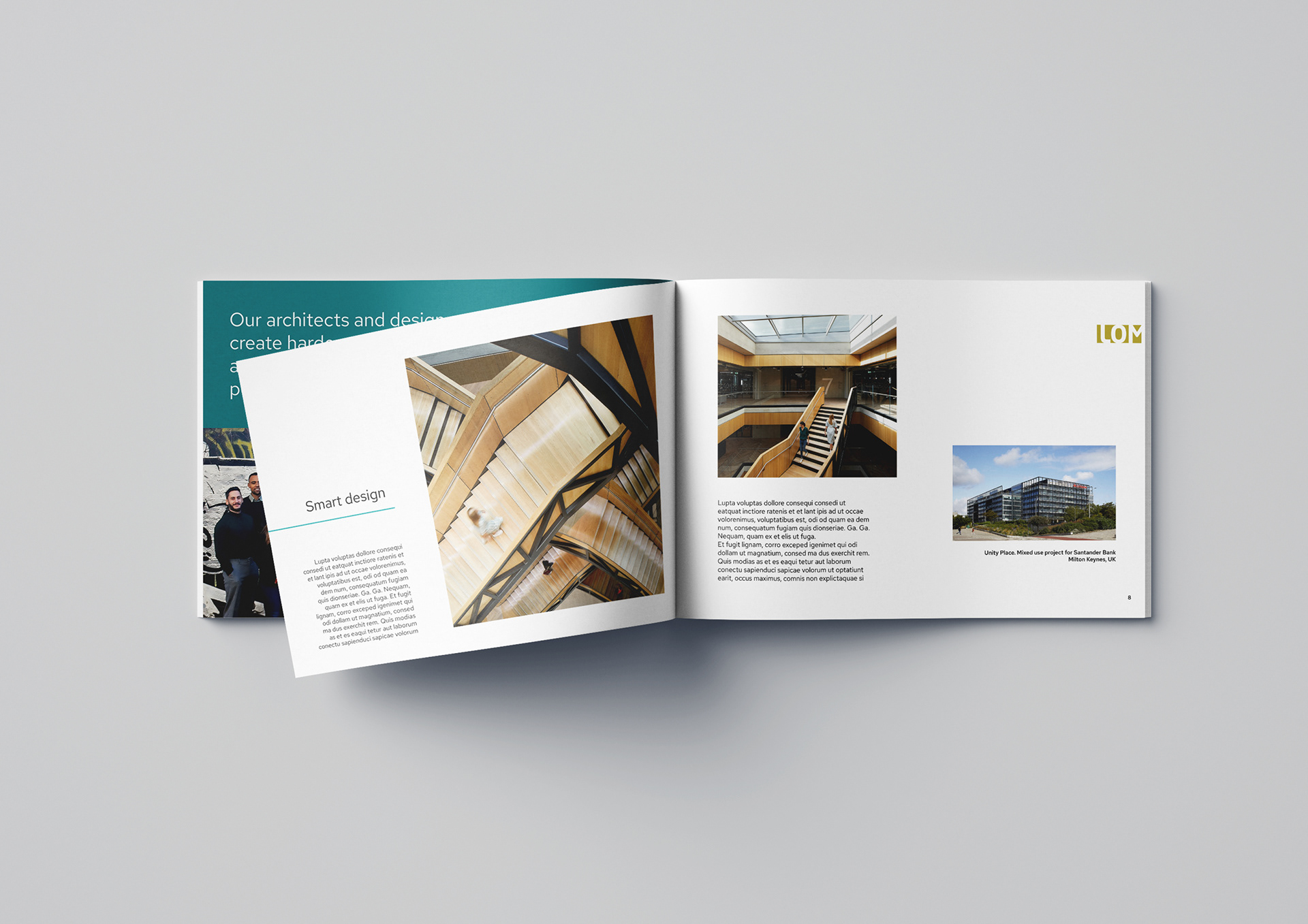
Deliverables: A strategic, fully developed brand package that elevates and modernises the brand image, complete with updated colour scheme, font, and brand messaging, that can be used across digital and printed materials.

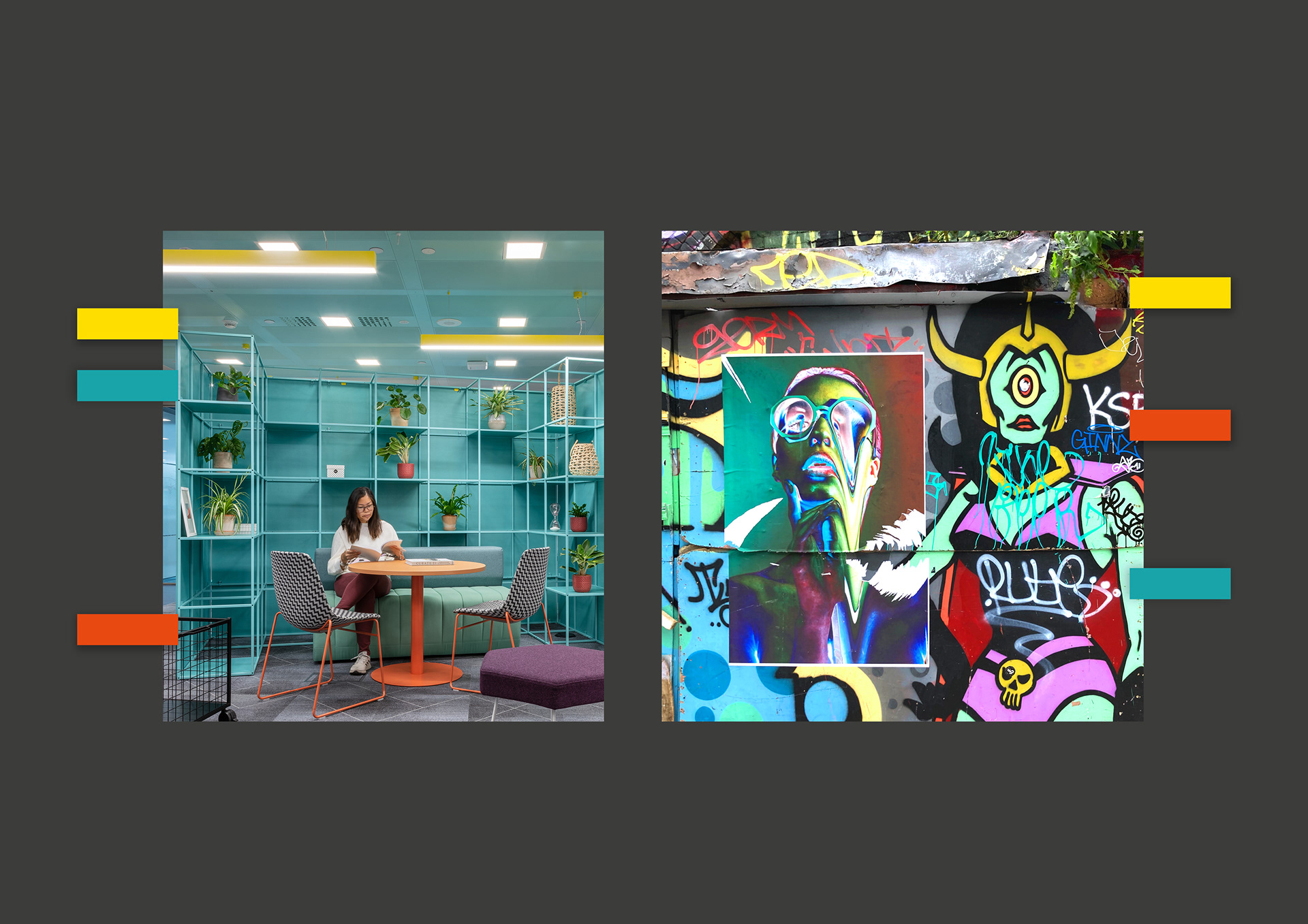
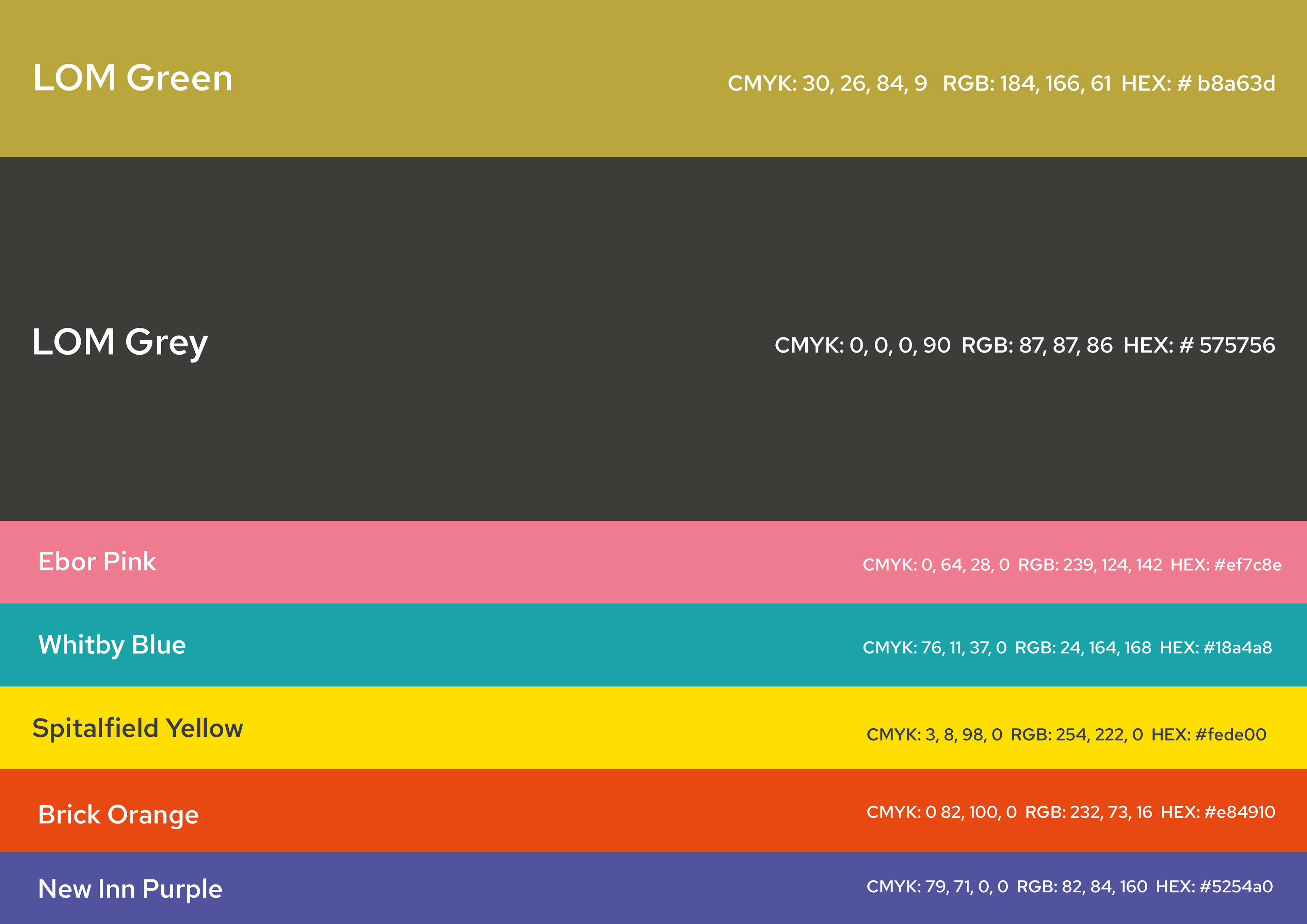
Keeping in mind the requirement to maintain the primary brand colour, 'LOM Green', a complimentary tonal grey was selected in order to pull together the primary and secondary palettes, and ensure accessibility to WCAG standards. The secondary palette, based on cross-referencing LOM's distinctive interior design colour schemes with the vibrant graffiti in the surrounding Shoreditch area, included colours specifically intended to act as highlights, in turn adding consistency and visual interest to all branded materials. Each colour was named after a nearby street in the local area.

Outcome: The brand refresh brought a new, flexible visual system to LOM that better reflects the studio's creative output and East London roots. Anchoring the design in both architectural context and local culture strengthened the brand identity and presence across the architecture space.